How to Use Color Effectively in Web Design

How to Use Color Effectively in Web Design and the Psychology Behind Color Choices
Colors have a powerful impact on our emotions, perceptions, and actions. They can evoke feelings, create moods, and influence our behavior. As such, the use of color in web design is an essential aspect of creating a successful website. In this article, we’ll take a look at how to use color effectively in web design and the psychology behind color choices.
The Basics of Color Theory
Color theory is the study of how colors interact with each other and how they can be used to create specific effects. There are a few basic concepts in color theory that are important to understand when designing a website:
-
Hue
Hue refers to the purest form of a color, such as red, blue, or yellow. It is the first quality of a color that we perceive.
-
Saturation
Saturation refers to the intensity of a color. A highly saturated color is pure and vibrant, while a low saturation color is more muted and gray.
-
Value
Value refers to the lightness or darkness of a color. A color with a high value is light, while a color with a low value is dark.
The Psychology of Color
Colors can have a powerful psychological impact on people. Different colors are associated with different emotions and meanings. For example, red is often associated with passion, anger, and danger, while blue is associated with calm, trust, and professionalism. It’s important to understand the psychological effects of colors when designing a website, as the colors you choose can have a big impact on how users perceive and interact with your site.
-
Warm Colors
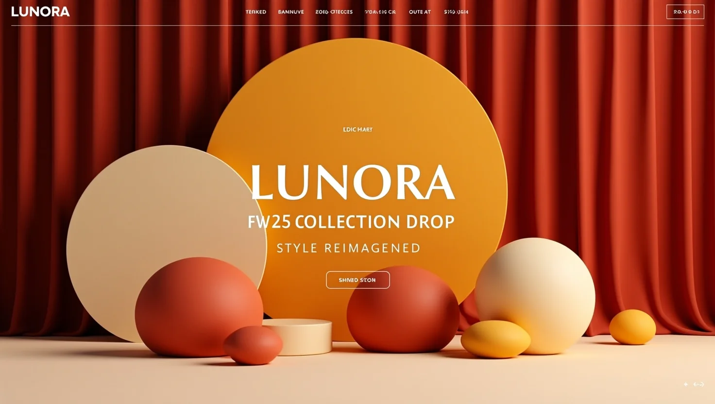
Warm colors, such as red, orange, and yellow, are associated with emotions such as passion, excitement, and warmth. They can be used to create a sense of energy, enthusiasm, and movement. Warm colors are also associated with hunger and appetite, which makes them a good choice for food and cooking websites.
-
Cool Colors
Cool colors, such as blue, green, and purple, are associated with emotions such as calm, tranquility, and professionalism. They can be used to create a sense of serenity and order. Cool colors are also associated with calmness, wisdom and trust, which makes them a good choice for banking, healthcare and legal websites.
-
Neutral Colors
Neutral colors, such as white, black, and gray, are associated with balance, purity and neutrality. They can be used to create a sense of elegance and simplicity. Neutral colors can also be used as a background color or to create a sense of contrast with other colors in the design. These colors are often used to create a sense of professionalism and sophistication, which makes them a good choice for corporate websites.
Choosing a Color Palette
When designing a website, it’s important to choose a color palette that supports the overall aesthetic and goals of the site. One way to do this is to use a color scheme, which is a combination of colors that work together harmoniously. There are several different types of color schemes that can be used in web design:
-
Monochromatic
A monochromatic color scheme uses variations of a single color. This can create a sense of cohesion and unity, and can also be used to create a sense of depth and dimension.
-
Analogous
An analogous color scheme uses colors that are adjacent to each other on the color wheel. This can create a sense of harmony and natural flow, and can also be used to create a sense of movement and change.
-
Complementary
A complementary color scheme uses colors that are opposite each other on the color wheel. This can create a sense of contrast and tension, and can also be used to create a sense of balance and equilibrium.
Implementing Color in Web Design
Once you have chosen a color palette, it’s important to implement the colors in a way that supports the overall aesthetic and goals of the site. There are several ways to use color in web design:
-
Background Colors
Background colors can be used to set the overall tone of a website. Light-colored backgrounds can create a sense of openness and airiness, while dark-colored backgrounds can create a sense of mystery and depth.
-
Text Colors
Text colors can be used to create contrast and emphasis. Dark text on a light background can be used to create a sense of professionalism and elegance, while light text on a dark background can be used to create a sense of drama and impact.
-
Accent Colors
Accent colors can be used to add visual interest and emphasis to specific elements on a website. They can be used to create a sense of hierarchy and organization, and can also be used to guide the user’s attention and create a sense of movement and flow.
Conclusion
Colors have a powerful impact on our emotions, perceptions, and actions. Understanding the basics of color theory and the psychology of color can help web designers create a more effective and engaging website. Choosing a color palette that supports the overall aesthetic and goals of the site, as well as implementing color in a way that supports the overall aesthetic and goals of the site, are crucial to creating a successful website. It’s important to keep in mind that color choices can have a big impact on how users perceive and interact with your site. Therefore, it’s important to choose colors that align with the message and goals of the website. With the right approach, the use of color in web design can help create a more compelling and impactful user experience.


